Color
The core color palette reflects our key offerings. Based on Tailwind colors, it creates consistency between brand and product while retaining colors optimized for UI.
Core palette
Our core palette brings together neutrals, blues, purples and gradients. Each color reflects an aspect of our offering, while the palette works cohesively across high-level Lumin brand communications. Other steps of each color, from 50 to 950, may be used where a piece needs them.
Extended palette
Our extended palette draws from Tailwind product colors to provide additional flexibility and contrast. Use these colors sparingly and seek approval from the Lumin marketing team.
Application
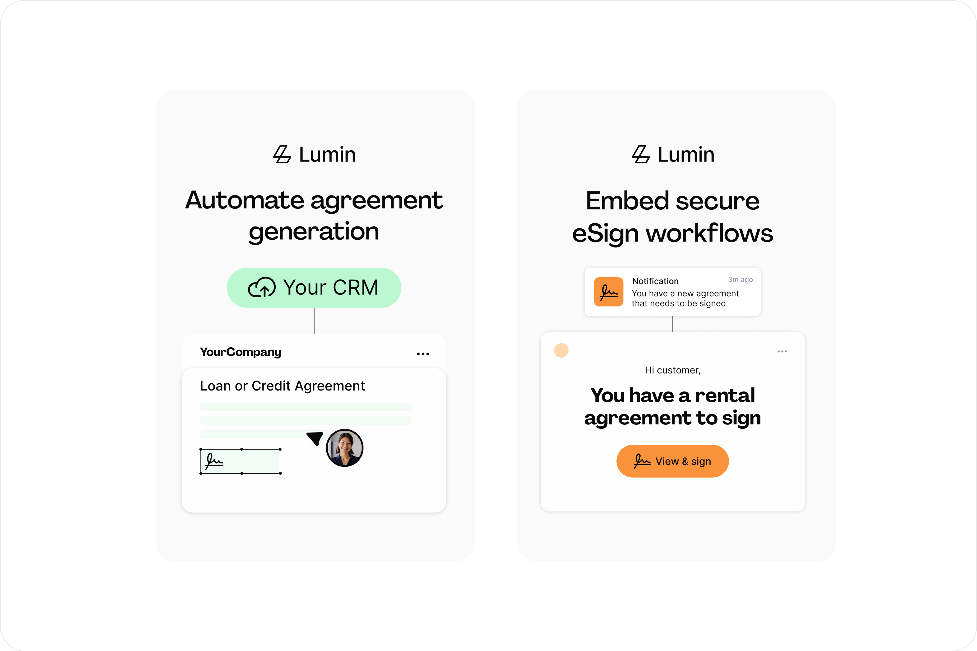
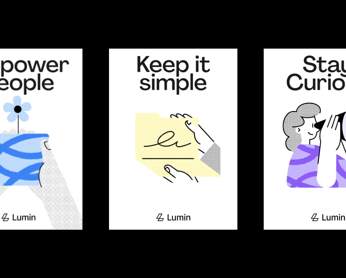
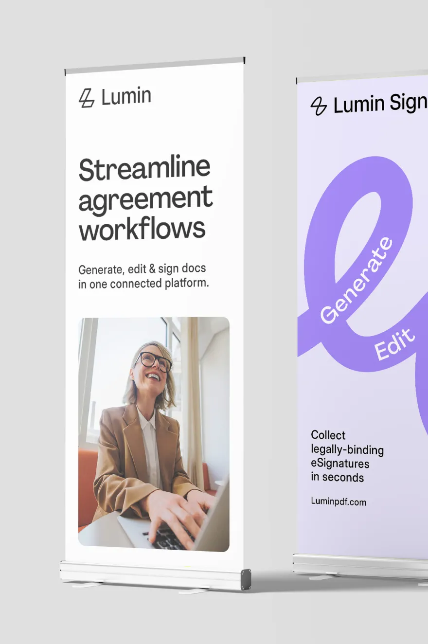
The following examples demonstrate how to apply Lumin’s color palette effectively, leading with core colors and using the extended palette where additional support may be required.

Color ratios
Color pairings
Incorrect usage
To protect the integrity of the Lumin brand, always use the approved colors and follow the guidance provided. The following examples show what to avoid.
Do not create new gradients
Do not use unapproved colors

Use the extended palette sparingly
Use color accents sparingly
Do not use multiple text colors at once

Do not apply texture or grain to solid colors