Typography
Typography gives Lumin a clear, consistent voice. These guidelines cover typefaces, weights and hierarchy to keep communications accessible and recognizable.
Display typeface
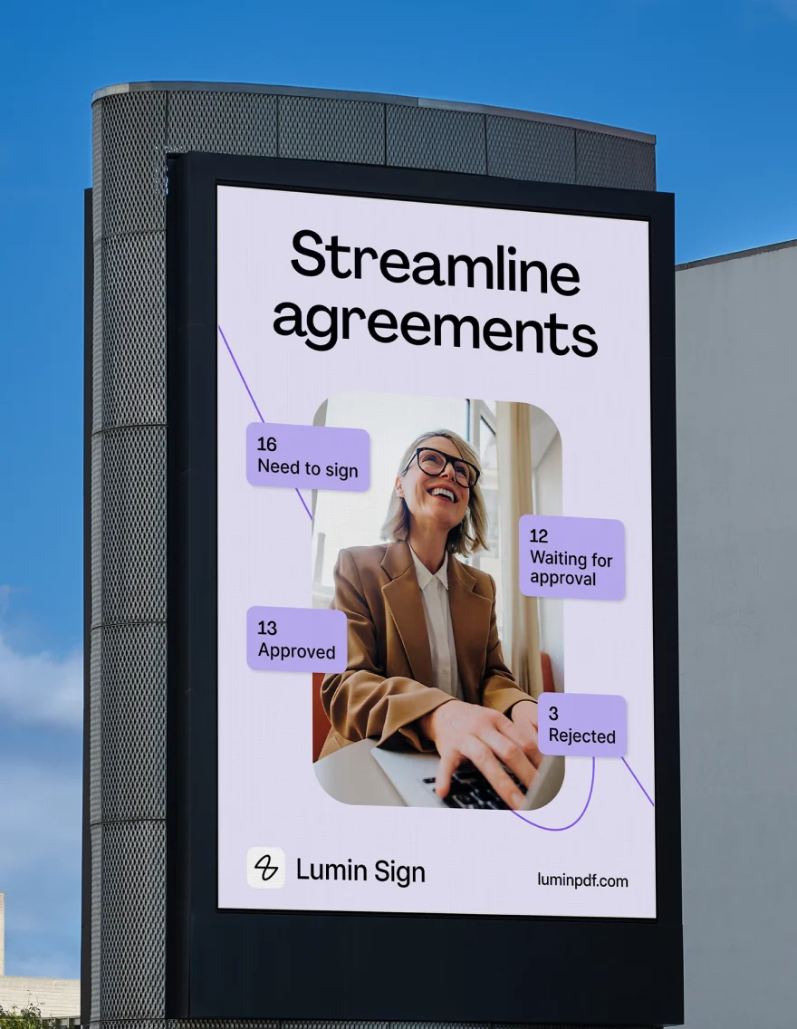
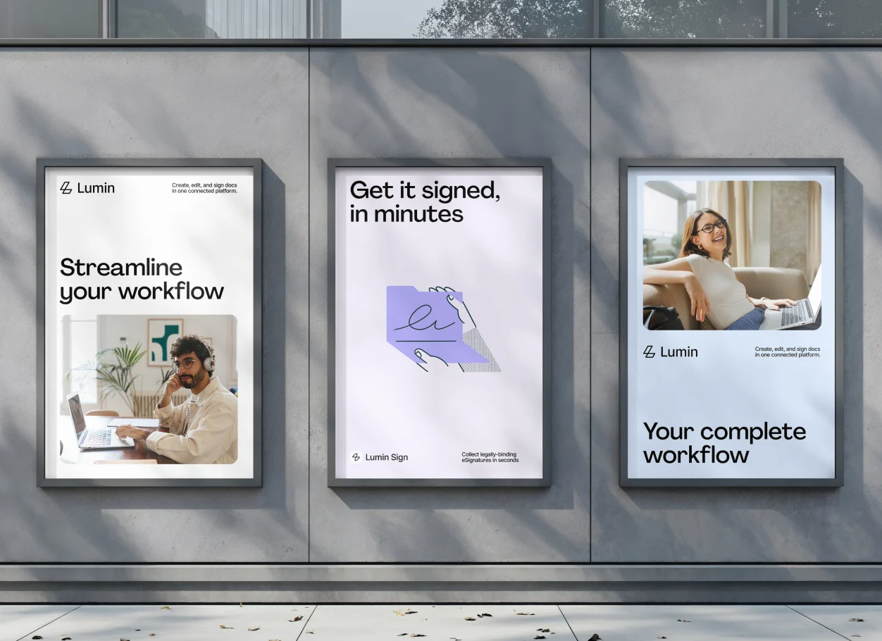
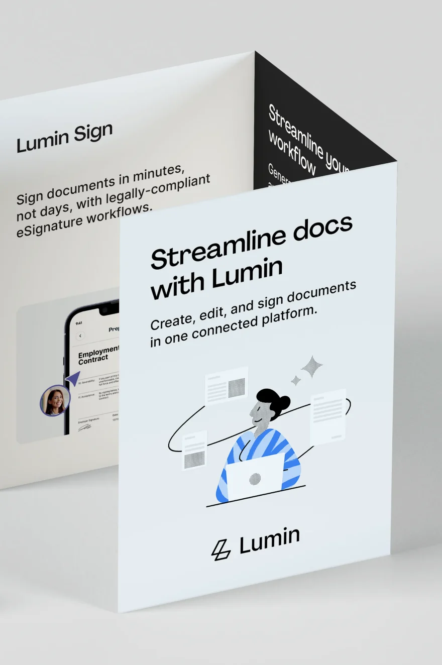
Agrandir is our display typeface, used to bring confidence and personality to key brand moments. Use it for headlines, campaign messaging and short statements where impact matters most. NOTE: Lumin team members and partners may use PP Agrandir Medium. Do not modify or customize the font files: editing, converting or redrawing them violates the license.
Agrandir Medium
abcdefghijklmnopqrstuvwxyzABCDEFGHIJKLMNOPQRSTUVWXYZ1234567890!@#$%^&*()+/
Secondary typeface
Inter is our secondary typeface, chosen for its clarity and versatility. Use it for body copy, supporting information and interface text to ensure content remains legible and accessible.
Type in use
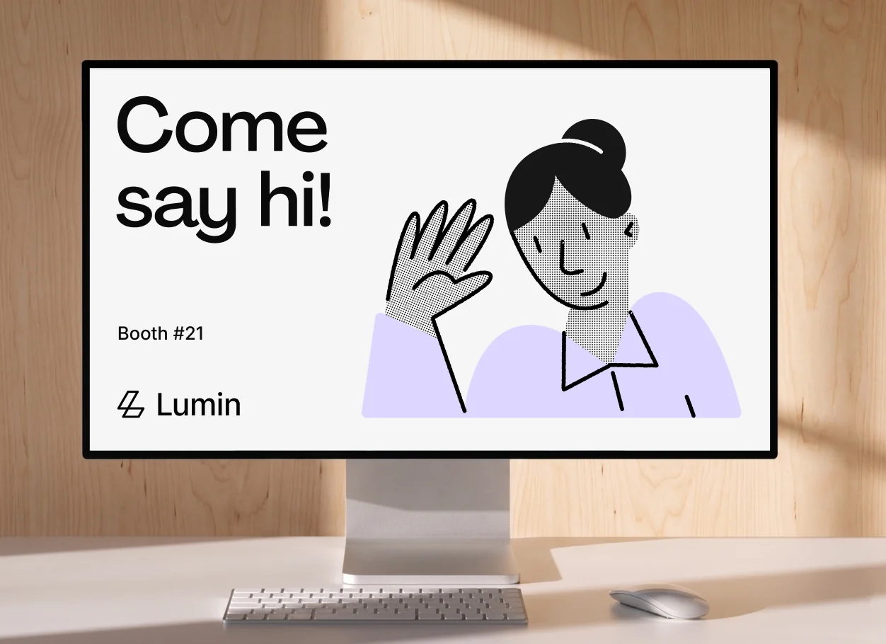
Typesetting
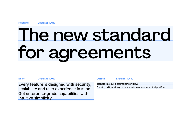
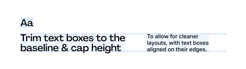
Custom lettering
Incorrect Usage
Use only approved typefaces and weights. Avoid distorted letterforms, excessive spacing, poor contrast and effects that reduce legibility.
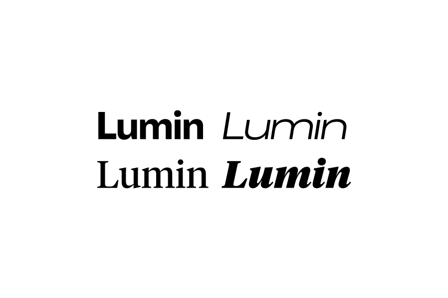
Do not use unapproved typefaces or variations.
Do not use all-caps
Do not use Agrandir for body copy
Do not add tracking
Do not modify wordmark lettering